Ikigai
Ikigai helps children grow with confidence, curiosity and care. We built a warm, rainbow-led identity that turns those values into a visual world — nurturing curves, joyful colour and a smile built into the mark itself.
Feel playful — without feeling childish.
Parents choose with the head; children respond with the heart. Ikigai needed an identity warm and joyful enough to delight kids, yet credible and considered enough to earn a parent's trust.
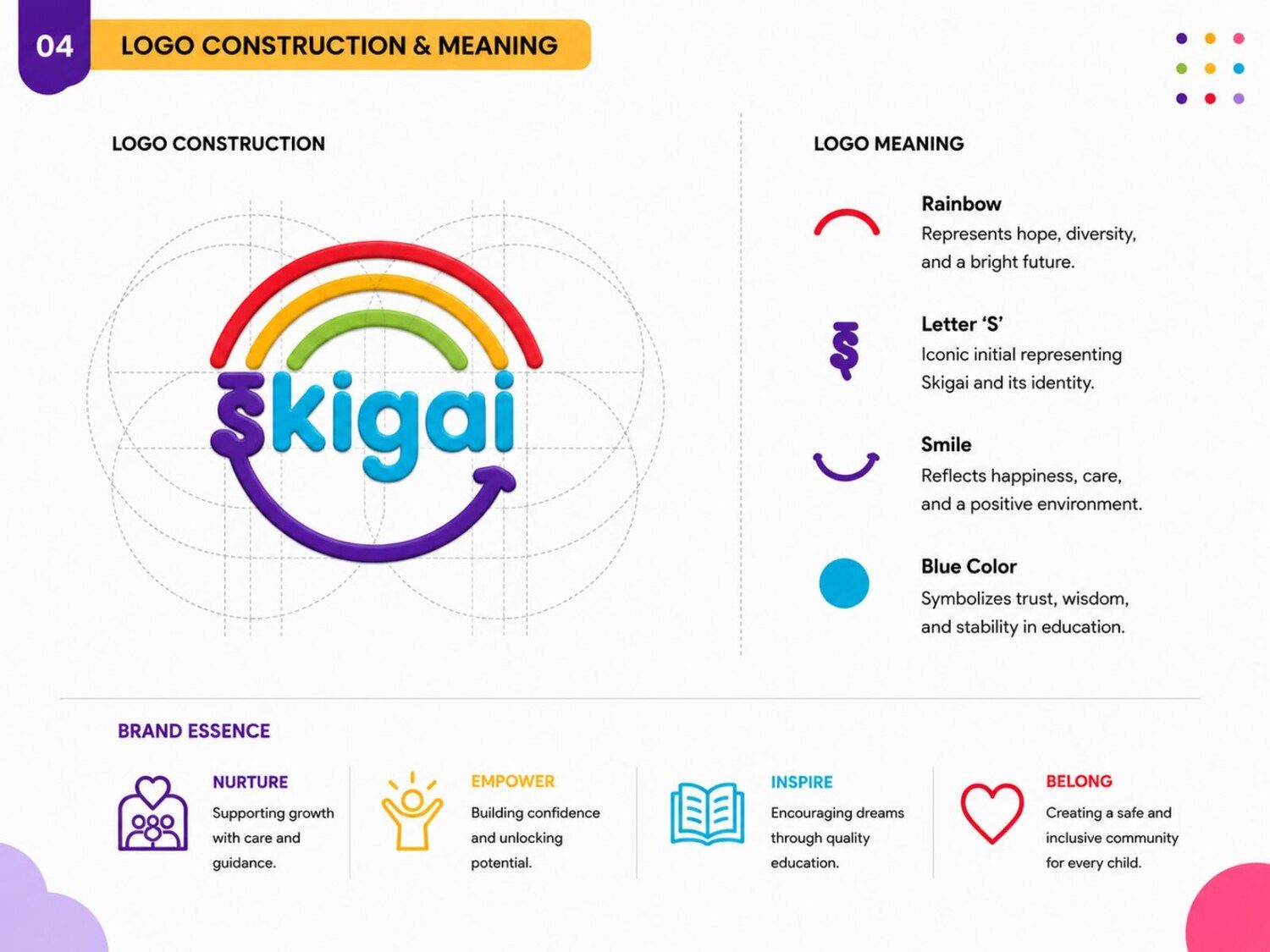
A rainbow that means something.
We anchored the brand in a rainbow arc — hope, diversity and endless possibility — finished with a smile that signals care and positivity. A friendly, rounded type system keeps every touchpoint approachable.
- A meaning-led logo: rainbow, the 'i', and a smile.
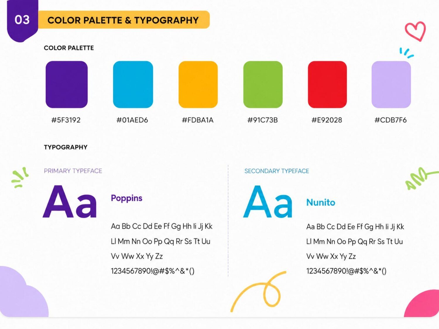
- A bright, optimistic palette with clear usage rules.
- Rounded, friendly typography across the system.
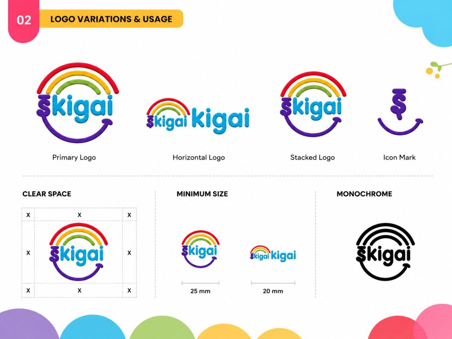
A complete brand board and toolkit.
Logo variations, colour and typography systems, construction guidelines and real-world collateral — ID cards, letterheads and stationery — give Ikigai a consistent, lovable presence everywhere it appears.